[bisq-network/bisq] Missing dark mode styling of popover trade period warning box (#3957)
Steven Barclay
notifications at github.com
Mon Feb 10 09:39:46 UTC 2020
<!--
SUPPORT REQUESTS: This is for reporting bugs in the Bisq app.
If you have a support request, please join #support on Bisq's
Keybase team at https://keybase.io/team/Bisq
-->
### Description
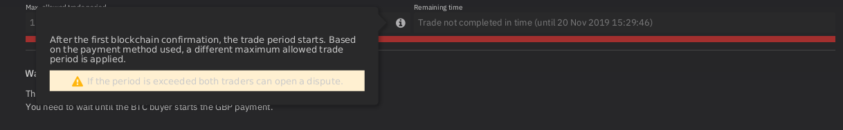
In dark mode, the _"If the period is exceeded..."_ warning box of the info popover in the trade step view appears to have the wrong styling. It looks like it should be dark yellow/pink rather than the same light yellow/pink for both modes. This also makes the warning text hard to read in dark mode.
#### Version
Latest snapshot of master.
### Steps to reproduce
Select dark mode, start a trade and check the info popover
### Expected behaviour
Different background colour in dark mode (say, dark yellow), to match the rest of the popover.
### Actual behaviour
Same warning message background colour (light yellow/pink) in light and dark mode.
### Screenshots
#### Device or machine
Linux
#### Additional info
N/A
--
You are receiving this because you are subscribed to this thread.
Reply to this email directly or view it on GitHub:
https://github.com/bisq-network/bisq/issues/3957
-------------- next part --------------
An HTML attachment was scrubbed...
URL: <http://lists.bisq.network/pipermail/bisq-github/attachments/20200210/6dfbde4f/attachment.html>
More information about the bisq-github
mailing list